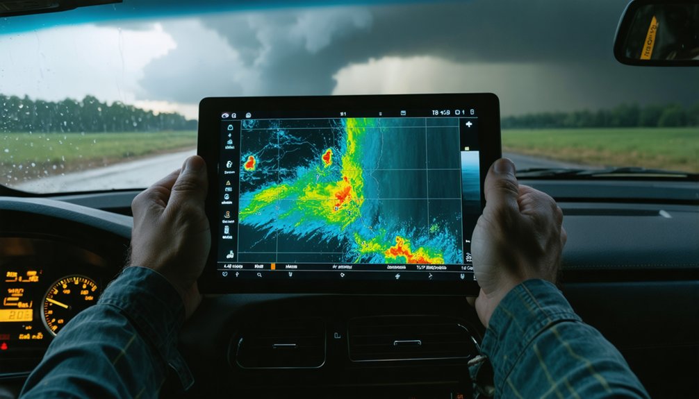
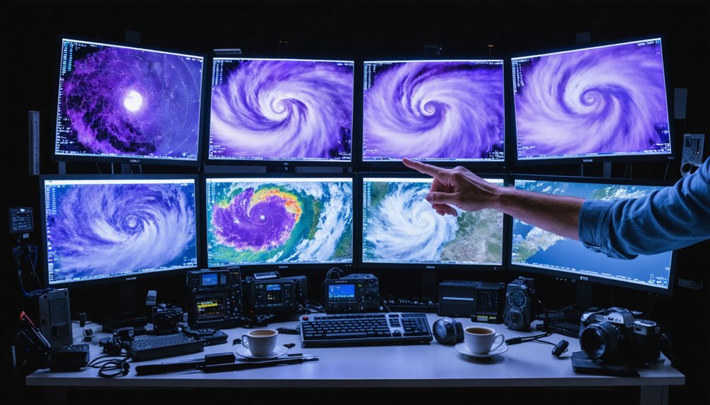
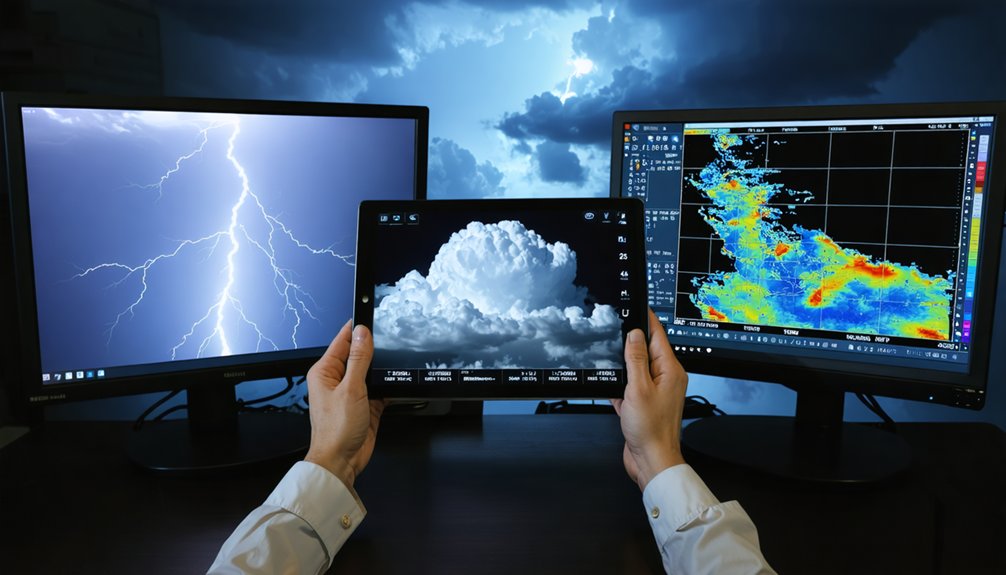
Analyzing atmospheric data in real time means you’re continuously ingesting, processing, and interpreting live streams from sensors, satellites, and numerical models simultaneously. You’ll manage noisy, asynchronous, and incomplete data while tracking variables like temperature, wind vectors, humidity, and aerosol concentrations as they evolve. Quality control, calibration, and data harmonization aren’t optional — they’re what separates a reliable forecast from a missed air quality alert. Keep going, and you’ll find exactly how to build that pipeline.
Key Takeaways
- Real-time atmospheric analysis continuously ingests live data streams from sensors, satellites, and models, tracking variables like temperature, wind, and aerosols.
- Ensuring data quality requires sensor calibration, outlier flagging, transmission error rejection, and validation against collocated reference measurements.
- Ground sensors provide localized precision, while satellites offer broad spatial coverage; combining both reduces blind spots and improves accuracy.
- Tools like Giovanni, Panoply, and ArcGIS enable visualization of geo-referenced atmospheric data across multiple formats and resolutions.
- Key challenges include calibration drift, data latency, and transmission errors, mitigated through automated quality control and optimized cloud processing.
What Is Real-Time Atmospheric Data Analysis?
Real-time atmospheric data analysis is the continuous ingestion, processing, and interpretation of live data streams from ground sensors, upper-air observations, satellites, and gridded model outputs. You’re working with variables like temperature, pressure, humidity, wind, precipitation, and aerosols as they evolve — not after the fact.
This differs fundamentally from historical climate analysis, where datasets are static and fully quality-controlled before use. In real-time workflows, you’re managing incomplete, noisy, and asynchronous data streams simultaneously.
Data interoperability becomes critical here — your sensors, satellites, and model products rarely share identical formats, resolutions, or coordinate systems. You must harmonize these inputs on the fly to extract actionable intelligence.
The payoff is significant: faster hazard detection, tighter forecast cycles, and sharper situational awareness across weather, air quality, and environmental monitoring applications.
Temperature, Wind, Aerosols: The Variables That Matter Most
When you’re analyzing the atmosphere in real time, not all variables carry equal operational weight — temperature, wind, and aerosols consistently drive the most critical decisions across forecasting, hazard response, and air quality assessment.
Temperature profiles reveal instability and frontal boundaries. Wind vectors, measured by anemometers and upper-air platforms, expose shear patterns and transport pathways. Aerosol concentrations flag dust intrusions, wildfire smoke, and volcanic ash events before they escalate.
You’ll rely on data interpolation to fill spatial gaps between ground sensors and satellite retrievals, producing coherent, actionable fields. Historical climate records give you the baseline context to distinguish anomalies from noise. Without that comparative foundation, real-time signals lose interpretive power.
Prioritize these three variables first — they anchor every downstream analysis you’ll run.
Best Data Sources for Real-Time Atmospheric Analysis
Knowing which variables to track only gets you halfway — you also need sources that deliver those variables reliably and fast. Data latency and sensor calibration directly affect whether your analysis reflects reality or lags dangerously behind it. Choose sources that prioritize both.
- NOAA — Operational weather and upper-air datasets with broad real-time coverage.
- NASA Earthdata — AIRS, MODIS, and GLDAS products covering temperature, aerosols, water vapor, and precipitation.
- UCAR’s Climate Data Guide — Structured guidance for selecting atmospheric records that match your specific application.
- Ground sensor networks — Local, calibrated sensors that complement satellite imagery with surface-level precision.
Each source fills a gap the others can’t. Cross-referencing them reduces blind spots and keeps your atmospheric picture accurate and current.
Ground Sensors vs. Satellite Data: Which Do You Need?
Both ground sensors and satellite data have distinct strengths, and choosing between them — or combining them — depends on your application’s spatial scale, latency requirements, and the variables you’re tracking.
Ground sensors deliver high temporal resolution and localized precision, but they require rigorous sensor calibration to maintain data integrity across networks.
Ground sensors excel at precision, but without rigorous calibration, that precision becomes your biggest liability.
Satellites offer broad spatial coverage, capturing aerosols, temperature profiles, and precipitation across regions no ground network can match.
If you’re monitoring local air quality, ground sensors are your primary asset. If you need continental-scale wind or water vapor fields, satellite retrievals are indispensable.
In most operational workflows, you’ll combine both — but that introduces data harmonization challenges, since sensor formats, resolutions, and measurement methodologies differ markedly. Aligning these sources correctly determines whether your analysis is reliable or misleading.
Top Tools for Real-Time Atmospheric Data Analysis
When you’re working with real-time atmospheric data, your choice of analysis platform directly shapes what you can detect, visualize, and report.
On the software side, tools like Panoply let you plot geo-referenced arrays from netCDF, HDF, and GRIB formats.
Meanwhile, Giovanni lets you visualize and analyze remote sensing data without downloading files.
For web-based workflows, platforms like ArcGIS support live layer inspection, time controls, and spatial pattern analysis that keep you grounded in current conditions rather than static snapshots.
Leading Analysis Software Platforms
As atmospheric datasets grow in volume and complexity, choosing the right software platform determines how quickly and accurately you can extract actionable insights. Cloud integration and sensor calibration support are non-negotiable features for reliable real-time workflows.
Consider these four leading platforms:
- Giovanni – Visualize and analyze NASA remote sensing data directly in your browser without downloading files.
- Panoply – Plot geo-referenced arrays from netCDF, HDF, and GRIB formats with precision.
- AppEEARS – Subset, transform, and download targeted atmospheric datasets efficiently.
- ArcGIS – Inspect live layers, apply time controls, and identify spatial patterns interactively.
Each platform addresses distinct workflow demands. Matching your data type, processing speed requirements, and visualization needs to the right tool keeps your analysis sharp and independent.
Web-Based Visualization Tools
Web-based visualization tools close the gap between raw atmospheric data and actionable insight by running analysis pipelines directly in your browser. Giovanni lets you query, subset, and plot NASA remote sensing products—covering atmospheric chemistry, temperature profiles, and aerosols—without downloading a single file.
RETIGO maps environmental variables across time-series plots, giving you immediate spatial context. For historical climate variability analysis, UCAR’s Climate Data Guide connects you to curated datasets with methodology guidance, ensuring you select records appropriate for your specific research scope.
These platforms eliminate local infrastructure dependencies, letting you work from any location with browser access. You can overlay precipitation radar, infrared satellite imagery, and aerosol optical depth layers simultaneously, compressing what once required dedicated workstations into flexible, cloud-hosted workflows that respond to your analytical priorities.
How to Build a Real-Time Atmospheric Workflow
Building a real-time atmospheric workflow requires integrating data sources, processing pipelines, and visualization tools into a coherent system. You’ll pull from historical climate records to establish baselines, then layer in live sensor feeds and satellite imagery.
Real-time atmospheric workflows demand seamless integration of data sources, pipelines, and visualization tools into one coherent system.
Understanding policy implications helps you prioritize variables like aerosols or greenhouse gases that regulators track closely.
Follow these four steps:
- Connect sources – Link ground sensors, NOAA feeds, and NASA Earthdata APIs for temperature, wind, and humidity.
- Harmonize data – Standardize formats across netCDF, HDF, and GRIB files using tools like Panoply.
- Process pipelines – Apply quality control and calibration routines at roughly 10-minute intervals.
- Visualize outputs – Deploy Giovanni or ArcGIS layers for live precipitation, aerosol, and infrared satellite mapping.
Calibration, QC, and Harmonization: Keeping Atmospheric Data Trustworthy

Once your workflow connects sources and pushes data through processing pipelines, the quality of your outputs depends entirely on how well you calibrate sensors, catch errors, and standardize formats. Sensor calibration isn’t optional—it’s the foundation that makes readings trustworthy. Drift, fouling, or hardware aging introduces systematic bias that corrupts downstream analysis if you don’t actively correct for it.
Beyond calibration, you’ll need robust quality control checks: flag outliers, reject transmission errors, and validate readings against collocated references. Sampling intervals matter too—aerosol and sky radiance measurements benefit from collection around every ten minutes.
Data harmonization then aligns units, timestamps, and spatial projections across sources. Without it, merging satellite retrievals with ground sensor feeds produces inconsistencies that undermine interpretation. Standardized formats keep your pipeline scalable and your conclusions defensible.
How Real-Time Atmospheric Analysis Serves Both Air Quality and Forecasting
Real-time atmospheric analysis pulls double duty: it feeds short-range weather forecasts while simultaneously tracking air quality conditions that affect public health. You’re working with live data streams that serve both missions when systems are built for data interoperability.
Here’s what effective real-time analysis delivers:
- Forecast support — Live temperature, pressure, and wind feeds initialize models that drive short-range predictions.
- Air quality monitoring — Near real-time aerosol and particulate data flag hazardous conditions before they escalate.
- Historical climate context — Comparing current observations against historical climate baselines reveals anomalies faster and sharper.
- Rapid hazard response — Satellite-derived dust and volcanic ash layers trigger immediate situational awareness.
When your pipeline maintains interoperability across sensor networks and satellite products, you maximize both forecasting accuracy and air quality responsiveness simultaneously.
How to Visualize Real-Time Atmospheric Data on Live Maps

When you build a live map workflow, you’ll want to select layers that match your target variables—infrared satellite imagery for cloud structure, precipitation radar for storm intensity, and aerosol optical depth for air quality context.
You can integrate real-time satellite feeds directly into platforms like ArcGIS, where time controls and legend tools let you inspect spatial patterns as conditions evolve.
Choosing Live Map Layers
Choosing the right live map layers determines how effectively you’ll interpret atmospheric conditions as they evolve. Prioritize layers that align with your monitoring objective and support satellite calibration standards for reliable signal interpretation.
Data harmonization across sources assures consistent spatial and temporal resolution. Consider these four layer types:
- Infrared satellite imagery — detects cloud-top temperatures and storm structure in near real time.
- Precipitation radar — tracks rainfall intensity and movement across your area of interest.
- Aerosol optical depth — monitors dust, smoke, and particulate distribution.
- Active storm tracks — displays hurricane, cyclone, and typhoon positions with projected paths.
Stack complementary layers deliberately. Overlapping incompatible resolutions introduces misinterpretation.
Match each layer’s update frequency to your analysis window for maximum situational accuracy.
Integrating Satellite Imagery
Once you’ve selected your live map layers, satellite imagery becomes the primary visual feed that ties them together. Infrared and visible bands let you track cloud patterns across regional and continental scales, revealing storm structure, convective activity, and frontal boundaries in near real time.
Overlaying aerosol dispersion data from MODIS or AIRS products sharpens your ability to detect dust plumes, wildfire smoke, and volcanic ash without waiting for ground sensor confirmation. Sync your imagery timestamps with radar and surface observation layers to maintain temporal consistency across your workspace.
Platforms like Giovanni let you pull these satellite-derived fields directly into comparative visualizations. Prioritize reprojected, calibrated products to avoid geometric distortions that misalign features across layers. Accurate integration demands attention to both spatial resolution and data latency.
Displaying Real-Time Patterns
How you render live atmospheric data on a map determines whether patterns become actionable or just visually busy. Layer selection, symbology, and update frequency all shape interpretation.
- Choose purposeful layers — stack infrared imagery, precipitation radar, and wind vectors without overcrowding your display.
- Set appropriate time controls — align refresh rates to your data cadence, roughly every 10 minutes for aerosols.
- Contextualize with historical weather — overlay baseline climatology so anomalies stand out against known climate variability ranges.
- Use interactive legends — dynamic legends let you rescale color ramps instantly as conditions shift.
Tools like ArcGIS and RETIGO support these workflows natively. Keeping your visualization clean and queryable means you’ll catch emerging atmospheric patterns before they escalate.
Why Real-Time Atmospheric Data Goes Wrong and How to Fix It
Even the most well-designed real-time atmospheric monitoring systems produce unreliable data when calibration drifts, transmission errors corrupt incoming streams, or sensor networks generate volumes too large to harmonize quickly.
Even the best atmospheric monitoring systems fail when calibration drifts, data streams corrupt, or sensor volumes overwhelm harmonization.
Sensor calibration failures introduce systematic bias across temperature, humidity, and pressure readings, skewing every downstream analysis you run. You’ll need scheduled recalibration routines and automated flagging protocols to catch drift before it propagates.
Data latency compounds these problems. When ingestion pipelines stall, your visualized patterns reflect conditions from minutes or hours ago, not now.
You can reduce latency by optimizing cloud-based processing pipelines and sampling aerosols and sky radiance at roughly 10-minute intervals. Apply quality control filters at ingestion, validate against redundant sensor sources, and monitor transmission links in real time to isolate errors before they corrupt your analysis.
Frequently Asked Questions
What Certifications Are Needed to Work in Atmospheric Data Analysis Professionally?
Ready to stand out? You’ll boost your career with certifications in remote sensing and data visualization, like ESRI’s ArcGIS credentials or NASA ARSET training, giving you the precise, data-driven edge atmospheric analysis demands.
How Much Does It Cost to Build a Personal Atmospheric Sensor Network?
You’ll spend $500–$5,000+ depending on sensor count and quality. Prioritize sensor calibration to guarantee data integrity. You control your data privacy since you’re building and owning an independent, decentralized network free from institutional oversight.
Can Real-Time Atmospheric Data Be Used for Legal or Insurance Purposes?
Yes, you can use real-time atmospheric data for legal compliance and insurance claims. Guarantee data privacy protocols protect your records, and verify sensor calibration so your timestamped, quality-controlled datasets hold evidentiary weight in disputes.
What Academic Degrees Best Prepare Someone for Atmospheric Data Careers?
You’ll excel in atmospheric data careers with degrees in Meteorology, Atmospheric Science, or Environmental Engineering. These programs build your expertise in climate modeling, sensor calibration, data analysis, and real-time observation systems essential for operational success.
How Do International Agencies Share Real-Time Atmospheric Data Across Borders?
You’ll find that international agencies enable cross-border data sharing through standardized protocols like WMO’s Global Telecommunication System. International collaboration lets you access harmonized satellite, surface, and upper-air observations transmitted continuously across shared networks worldwide.
References
- https://www.ametsoc.org/ams/education-careers/education-program/k-12-teachers/datastreme-program/datastreme-atmosphere/weather-studies-maps-links/
- https://learn.arcgis.com/en/projects/predict-weather-with-real-time-data/
- https://www.noaa.gov/education/resource-collections/data/weather-atmosphere
- https://climatedataguide.ucar.edu/climate-data
- https://earthscience.stackexchange.com/questions/9527/upper-air-dataobservation-and-analysis-step-for-gfs-model
- https://ccsds.org/Pubs/140x1g2.pdf
- https://crazystormchasers.com/tools-for-real-time-atmospheric-data-analysis/
- https://www.earthdata.nasa.gov/topics/atmosphere/data-access-tools
- https://www.earthdata.nasa.gov/topics/atmosphere/data-access-tools?page=0
- https://www.epa.gov/air-sensor-toolbox/air-sensor-data-tools